The difference between a mailer box that looks sharp on the porch and one that arrives with a blurry logo and a headline sliced in half usually comes down to file setup, not print quality. Most rejected or reprinted mailer artwork fails for the same handful of reasons: art that stops at the cut line instead of running past it, text parked on top of a fold, images that looked fine on a laptop but were never big enough to print, and colors built in the wrong mode. None of that is hard to avoid once you understand how a flat corrugated blank becomes a folded box. This walkthrough covers how to set up a print-ready mailer box dieline the way a packaging printer expects to receive it.
Start with the dieline, not the design
A dieline is the flat, unfolded map of your box. It shows every panel, every fold as a crease line, and every cut as a solid line, all laid out in one plane. The single most important habit is to build your artwork on top of the dieline the printer gives you, at the exact size they supply, rather than designing a nice front panel and hoping it maps onto the box later. A roll end tuck front mailer, the self-locking style most common for ecommerce and subscription shipments, unfolds into a shape where the lid, the base, two side walls, and several tuck and dust flaps all sit in different orientations. If you design blind and let the printer drop your art onto their template, the odds of a panel landing sideways go up sharply.
Keep the dieline on its own layer, locked, set to a non-printing spot color, and place all of your artwork on a separate layer beneath it so the crease and cut marks stay visible while you work. If you are adding finishing effects such as spot gloss, foil, or embossing, each of those belongs on its own clearly named layer drawn in a single flat spot color, because the printer treats them as separate tooling passes rather than part of the CMYK image.
Bleed, trim, and the safe zone
Three boundaries govern where your art can safely live, and the schematic below shows all three on a single panel. The trim line is where the blade actually cuts. The bleed is the margin you extend background color and imagery past that trim line so a tiny shift on the cutting table never leaves a sliver of bare board at the edge. The standard bleed for packaging is 3 millimeters, roughly an eighth of an inch, on every outer edge. The safe zone is the opposite buffer: an inner margin where you keep anything you cannot afford to lose, such as logos, body copy, legal text, and barcodes. Six millimeters in from every cut and fold is a sensible working minimum, and more is better near creases because folding steel rounds the corner of a printed image and can distort anything sitting right on the line.
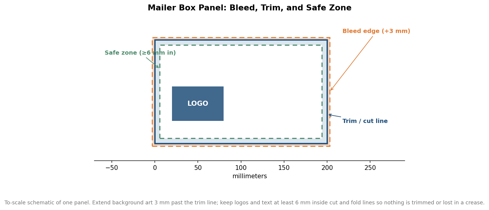
The fold rule deserves its own emphasis. A crease is not a clean hinge; it crushes and stretches the board across a few millimeters, so a line of text straddling a fold will look broken even when the file was perfect. Slide it fully onto one panel. Barcodes are the other classic casualty. They need quiet space and a flat panel to scan reliably, so give them a generous margin and never let one wrap a corner.
Resolution and color that survive printing
Corrugated printing is unforgiving of low-resolution raster art. The number that matters is not the pixel dimensions of your file in the abstract but the effective resolution at final print size, which is simply the image’s pixel width divided by the width it will be printed. Aim for at least 300 pixels per inch at the size the art actually appears on the box. A logo that looks crisp at thumbnail size on screen can be well under that threshold once it is stretched across a lid, and the chart below shows how quickly effective resolution falls as the same source image is scaled up.
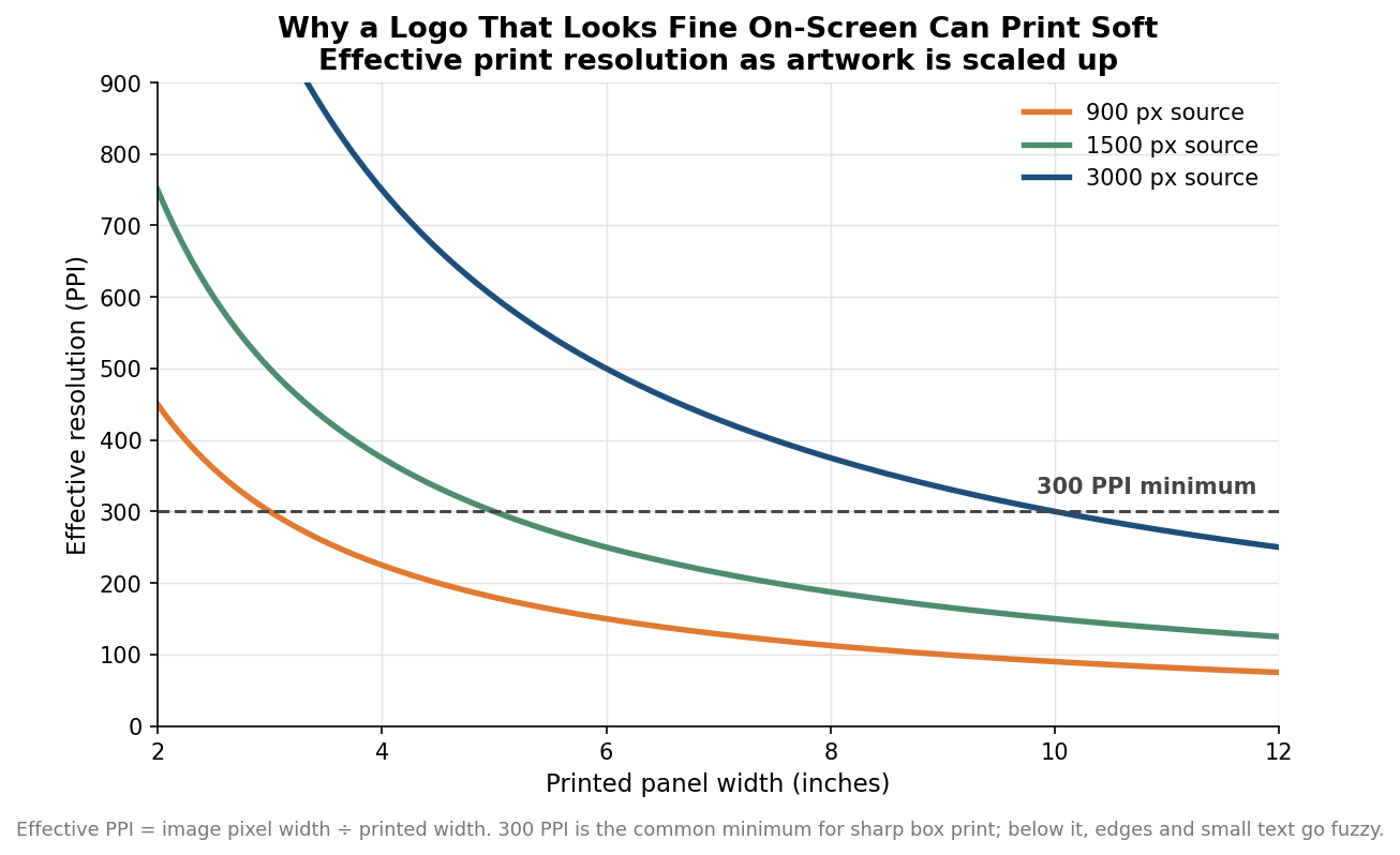
The practical takeaway is to source logos and key graphics as vector files whenever possible, because vector art stays sharp at any size and sidesteps the resolution question entirely. Save logos as vector, convert all live text to outlines before you submit so a missing font never reflows your layout, and either embed linked images or send them alongside the working file. For photographs and other raster elements that cannot be vectorized, build them large enough to clear 300 ppi at final size rather than enlarging a small file after the fact, which invents detail that was never there.
Color is the last common trap. Screens display in RGB, but presses print in CMYK, and a saturated RGB blue or a bright RGB green will shift noticeably when converted. Build the file in CMYK from the start so what you approve on screen is closer to what comes off the press, and if a specific brand color has to be exact, ask whether the run supports a spot color for it rather than relying on a four-color mix.
Panel orientation and the base flip
This is the step that surprises first-time buyers. Because of how a roll end mailer folds, the artwork on the base panel is often rotated 180 degrees relative to the lid on the flat dieline, so that both read upright once the box is assembled. If you place a repeating pattern or a centered message without checking orientation, half of it can end up upside down on the finished box even though the flat file looked correct. Every reputable printer publishes an orientation guide or marks “this way up” on the template. Follow it panel by panel, and physically fold a printed proof or a paper mock-up before approving a full run, because a two-minute paper fold catches orientation mistakes that are invisible on a flat screen.
A five-minute preflight before you upload
Before you send files, walk one quiet lap through the checklist. Confirm the document is CMYK and that 3 millimeters of bleed extends past every outer edge. Check that logos, text, and barcodes sit at least 6 millimeters inside every cut and fold, with nothing crossing a crease. Verify that every raster image clears 300 ppi at its printed size and that vector logos are used where you have them. Make sure all text is outlined and all images are embedded or included. Finally, confirm each panel’s orientation against the dieline guide and, ideally, against a folded paper proof.
Lead times on custom mailers typically run in the range of one to three weeks from approved artwork depending on quantity, finishing, and whether you order a physical proof, and that figure is indicative rather than a quote for any specific job. The files you approve at the start of that window are exactly what ships at the end of it, so the preflight pass is the cheapest quality control you will ever run. Get the dieline, bleed, resolution, color, and orientation right, and the box that lands on a customer’s doorstep looks like the one you designed.